Brand History & Background
the ké concept was born out of the need to express untapped creativity sitting at home, in the form of a wife, mother, and housemaker named Kanan Bhansali.
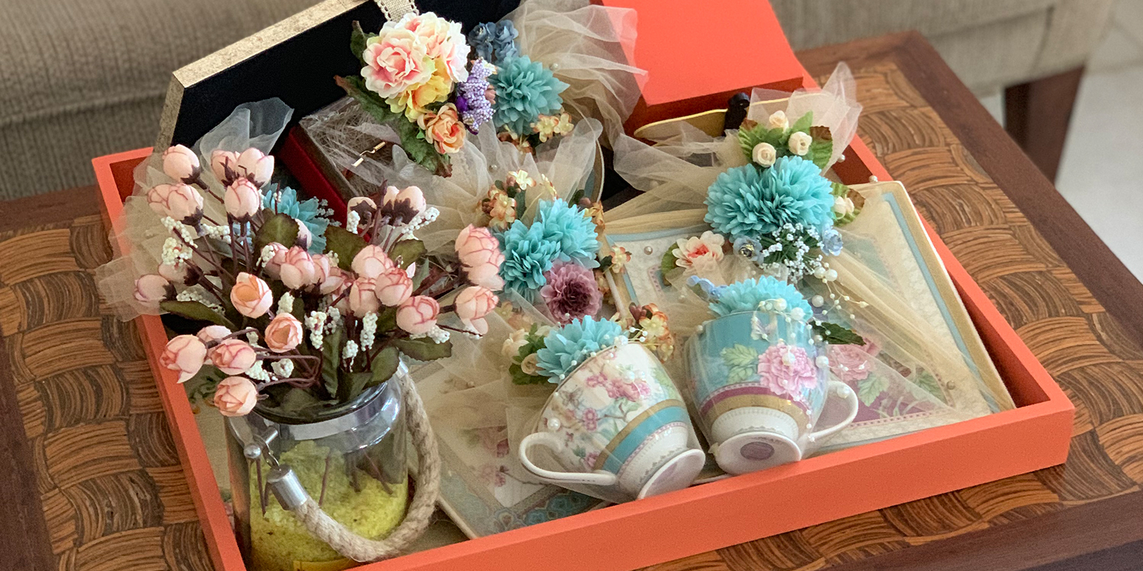
The founder, Kanan, has always enjoyed used art to express her emotions and to induce positive emotions in others. She believes that the experience of gifting should not be limited to the type or price of the gift itself, but rather should be holistic in its expression of the deep feelings of the gifter. The intangible wishes, blessings, and joy that we mean to shower our family and friends with are often lost because there is only so much emotion a money cover or a gold coin can capture. the ké concept strives to enhance the entire gifting experience by showering the receiver with a package of care, love, and blessings. The package serves to emphasize that the actual ‘gift’ is only a symbol of the inexpressible love we feel for each other.
Brand Name
The “ké” in the ké concept comes from the French romanticization of “kay”, the initials for Kanan, Adesh, and Yash. The founder, Kanan Bhansali, has two young children – Adesh and Yash – who are the apples of her eyes and the reason she feels the need to express her love in different, endless ways.
The “concept” bit of the name comes from the idea that our brand focuses not on providing you better gifts to give, but on redefining the concept of gifting. We want to take the gifting experience between you, as a well-wisher, and your beneficiary to a whole other level. That is our purpose, that is our promise.
Logo & Colours
Our logo draws inspiration from nature, borrowing the delicate ké butterfly as a symbol of creativity and beauty of life. Observing the soft, subtle movements of a butterfly can give us immense pleasure, taking us right into a powerful moment full of presence and emotion. That is the experience we want every gift receiver to feel.
The purple and green colours in the logo highlight the beautiful and elegant, but still simple, butterfly from the vast gardens of creativity.
It should be noted that we always position the butterfly at the top of any page or surface because we believe that the butterfly should always resemble nimble flight. Holding down the butterfly at the bottom of the page would be akin to holding down the creativity in each and every one of us, which would make the world a much duller place.
We always maintain the recommended clear space around the butterfly to ensure that the ké butterfly has enough breathing room to flap its pretty wings.
Our typography is thoughtfully selected to convey a feeling of the free-flowing energy that brings about creativity and joy in our lives. Coincidentally, the font name ‘Talking to the Moon’ fits in with our idea of the flying butterfly talking to the moon and radiating its light in the dark of the night. In the darkest of our times, the ké butterfly can lighten up our lives with a little gift full of emotions and blessings.


